Design Files: Philanthropy By Design

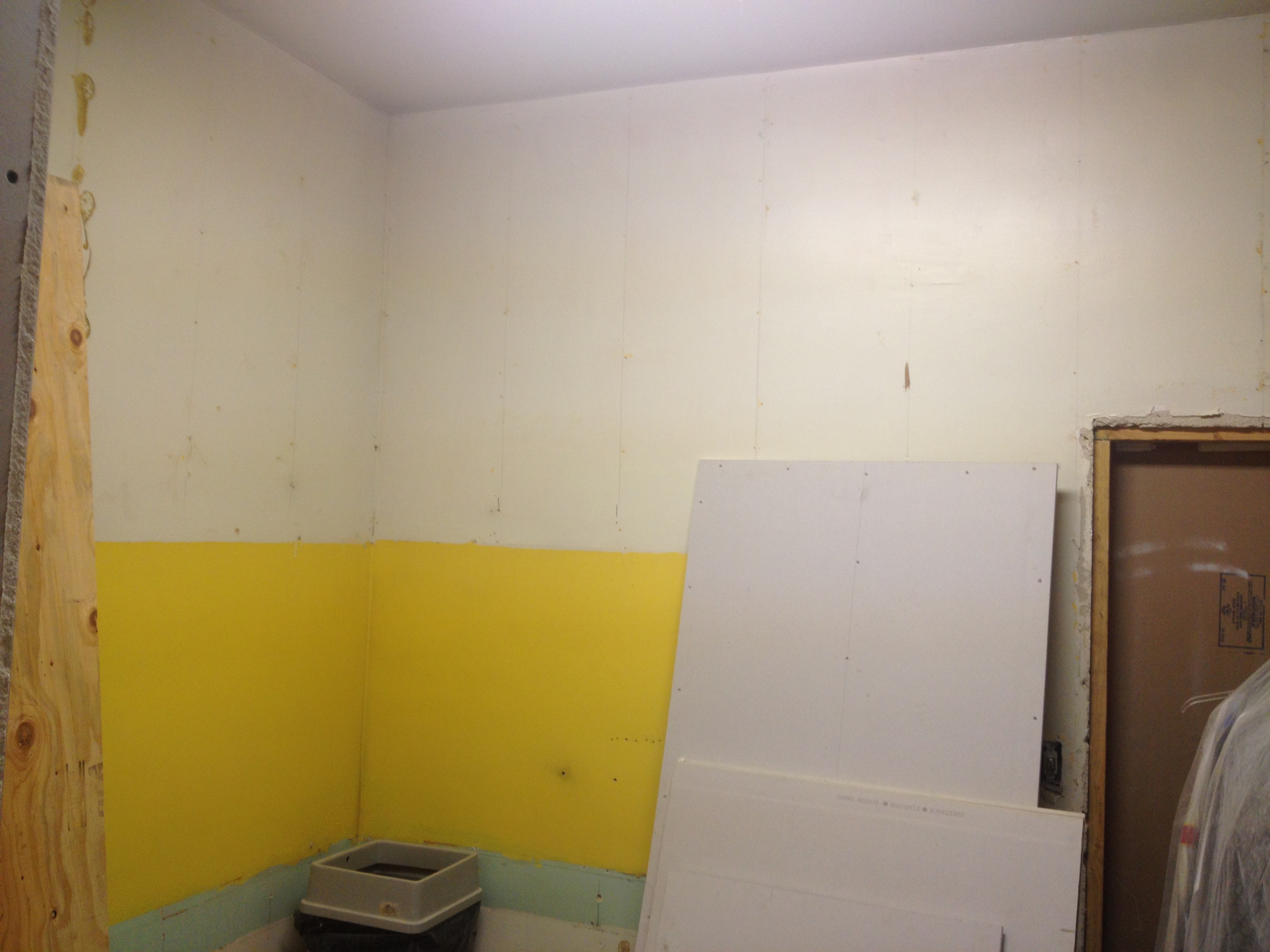
I just realized that I’ve never revealed another great project.  There is an organization called by Philanthropy by Design which helps nonprofit organizations improve their spaces with the assistance of interior designers.  It’s a fantastic organization and I was lucky to be able to volunteer my services.  My project was one of the SRO community rooms in San Francisco. SROs are essentially residential hotel rooms for low-income residents typically with shared bathrooms and common spaces.  This room was in the basement and acted as the tv room/dining room/relaxation room for all the hotel residents.    It started like this:

CIMG4642 CIMG4643 CIMG4644 CIMG4650
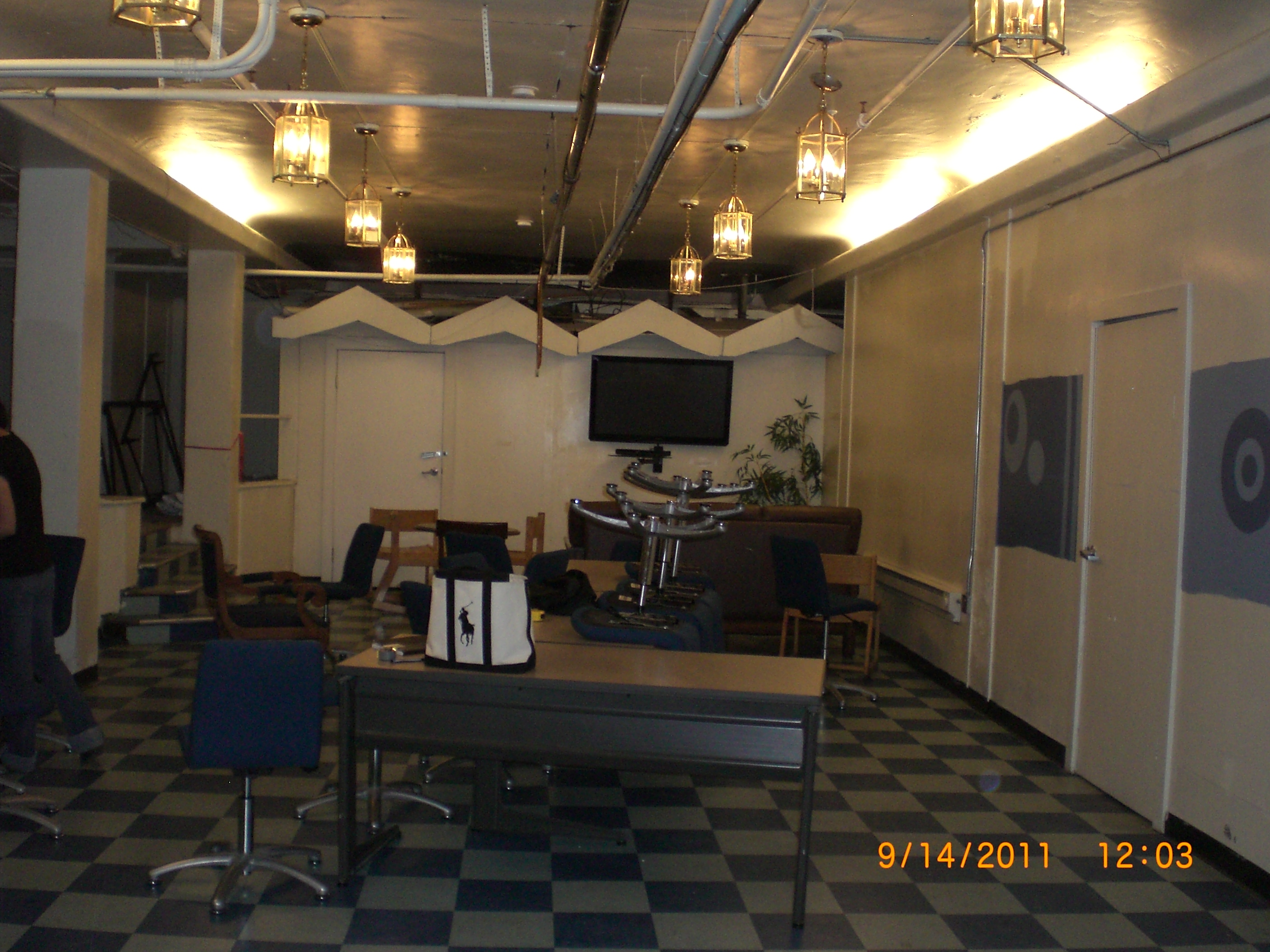
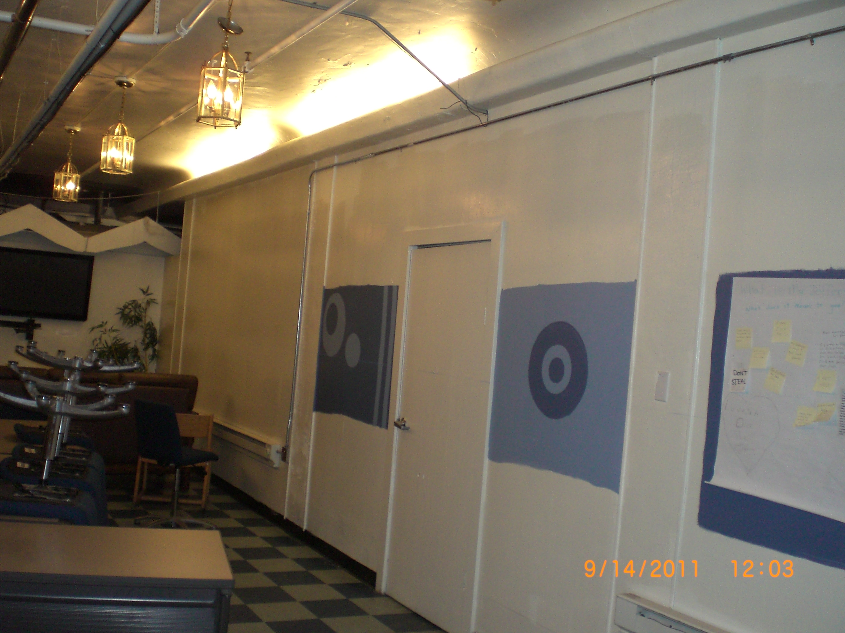
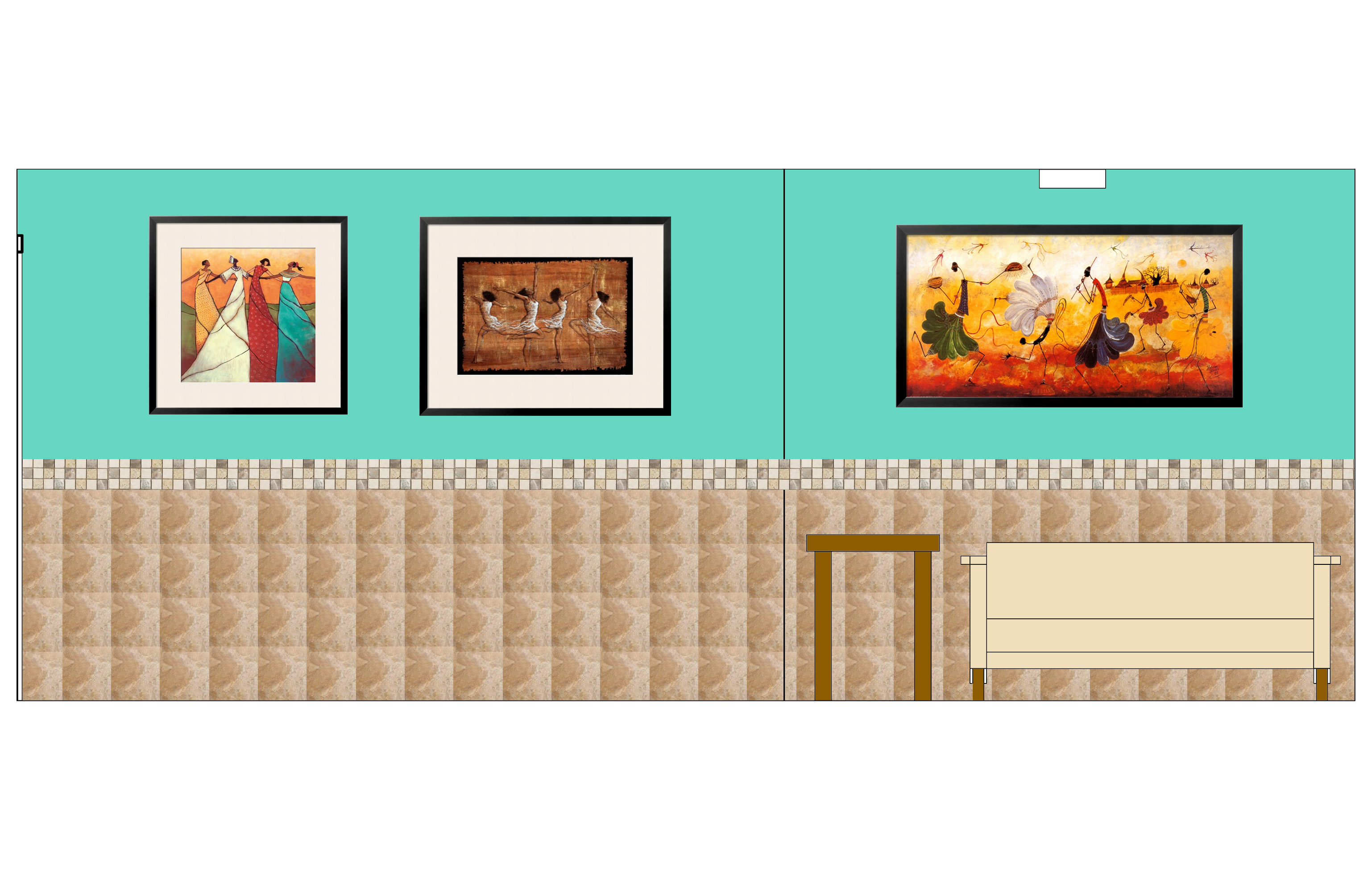
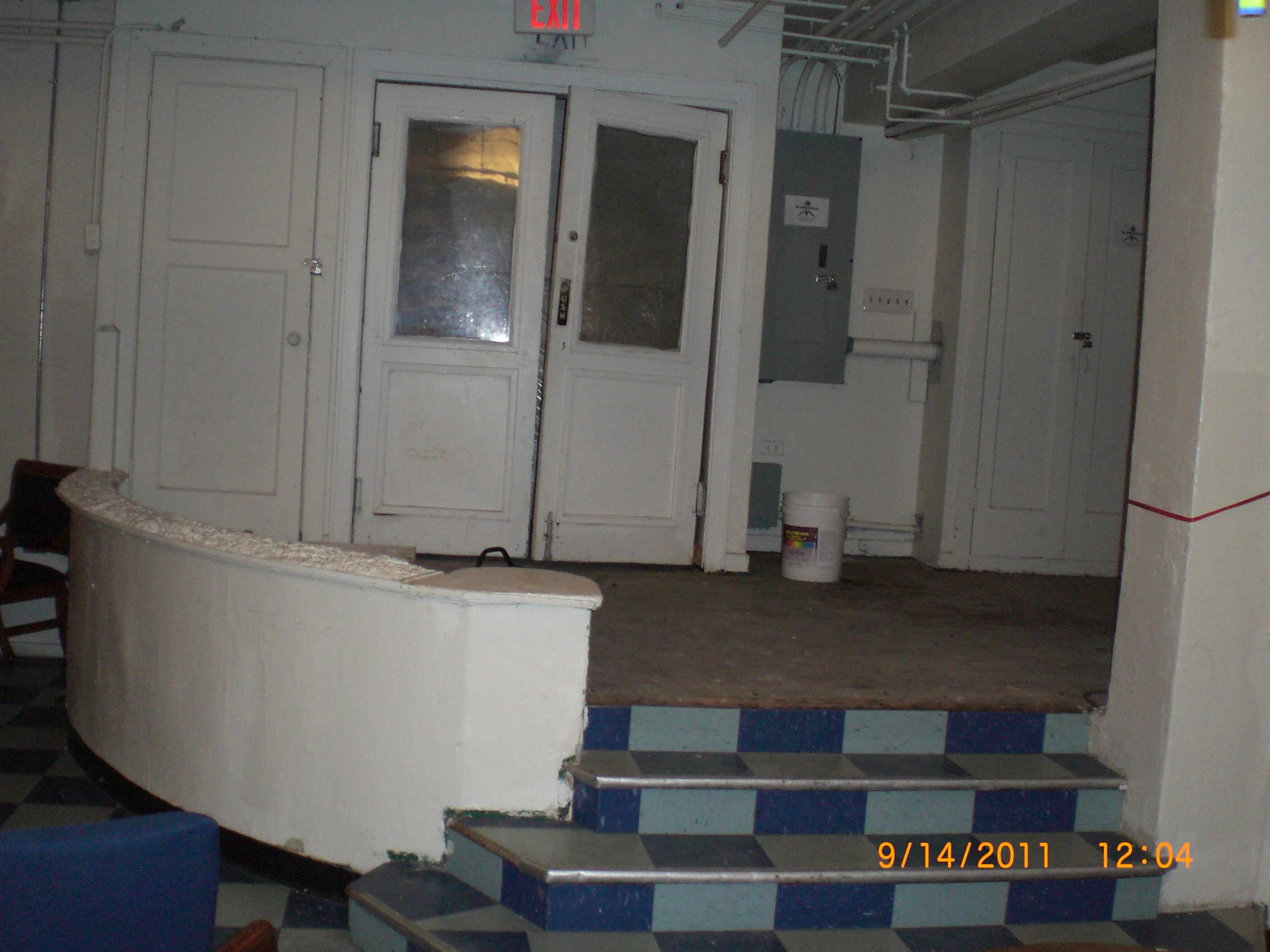
Obviously, this room was a little rough around the edges and we were tasked with making it more inviting and less depressing.  Working with a team of volunteers, I came up with the plan to clean it up, make it a lot more colorful, and deal with all the poor construction issues – the exit doors not working, a “countertop” with broken glass shards, a ceiling that had seen many better days, and poor craftsmanship in other areas.

Unfortunately, I don’t have any after pictures with the furniture but the difference we made with just one weekend with Rebuilding Together (another great nonprofit organization) and dozens of volunteers is amazing.

IMG_0747 IMG_0744 IMG_0743 IMG_0749 IMG_0751

IMG_0734
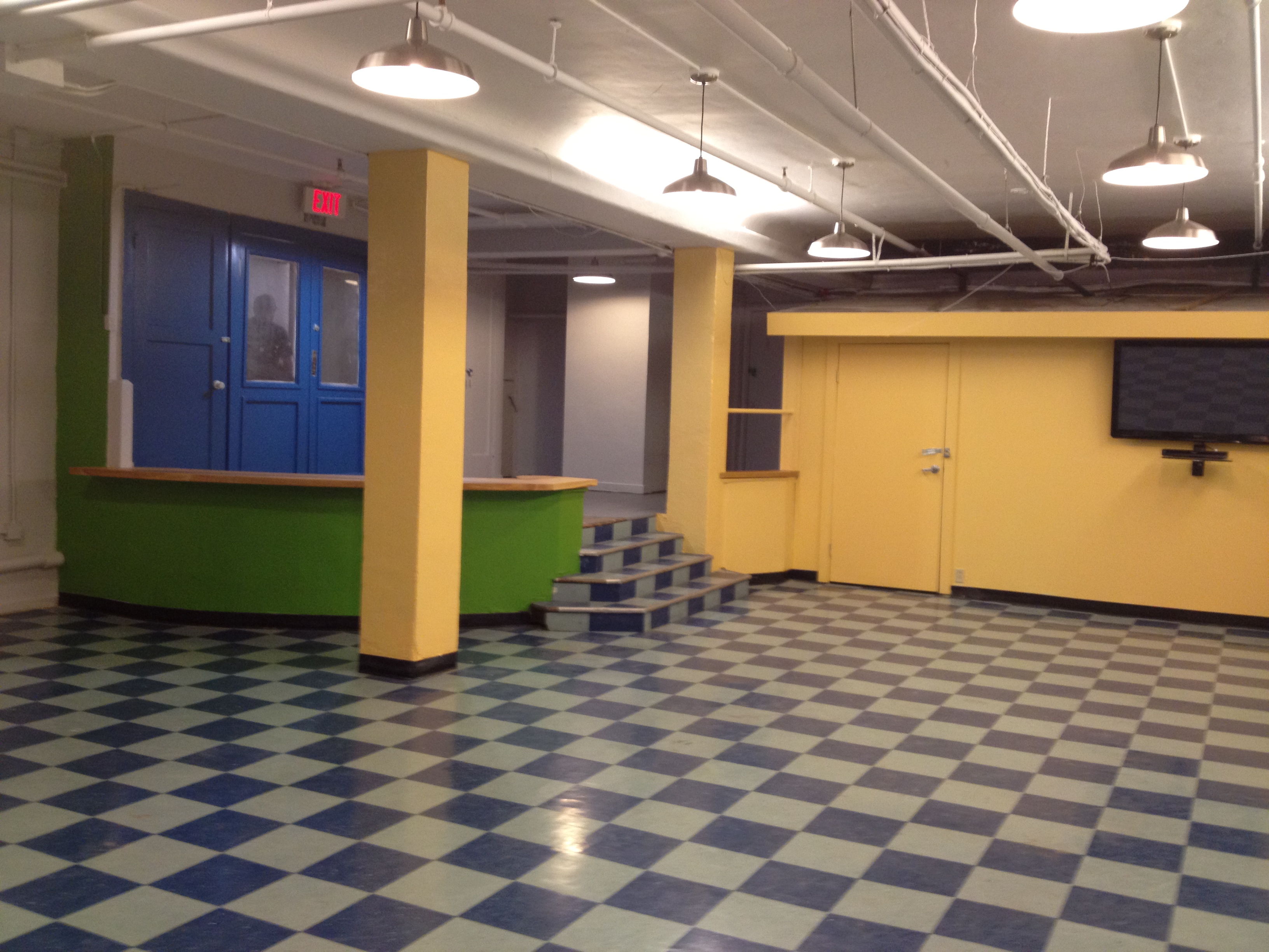
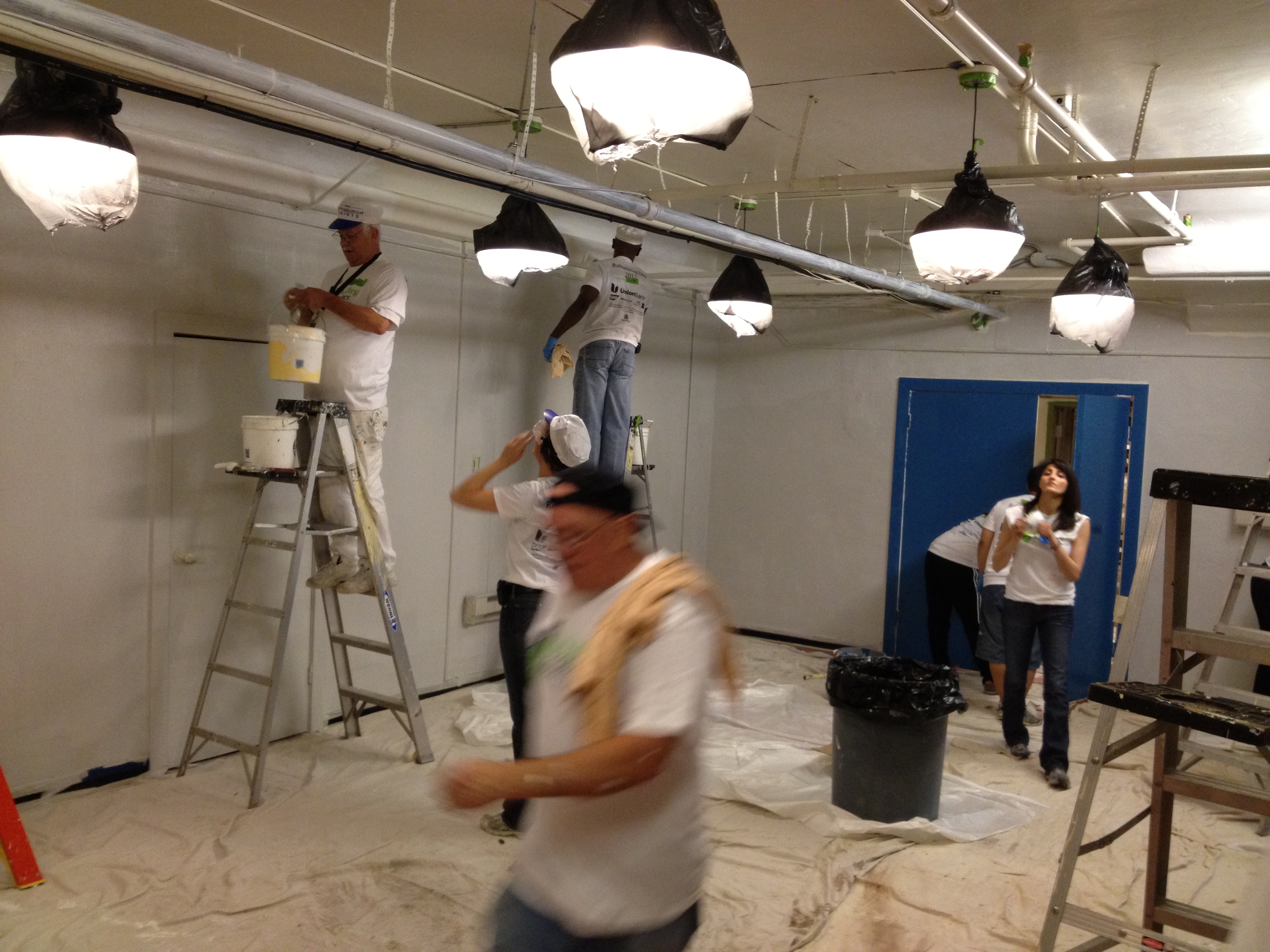
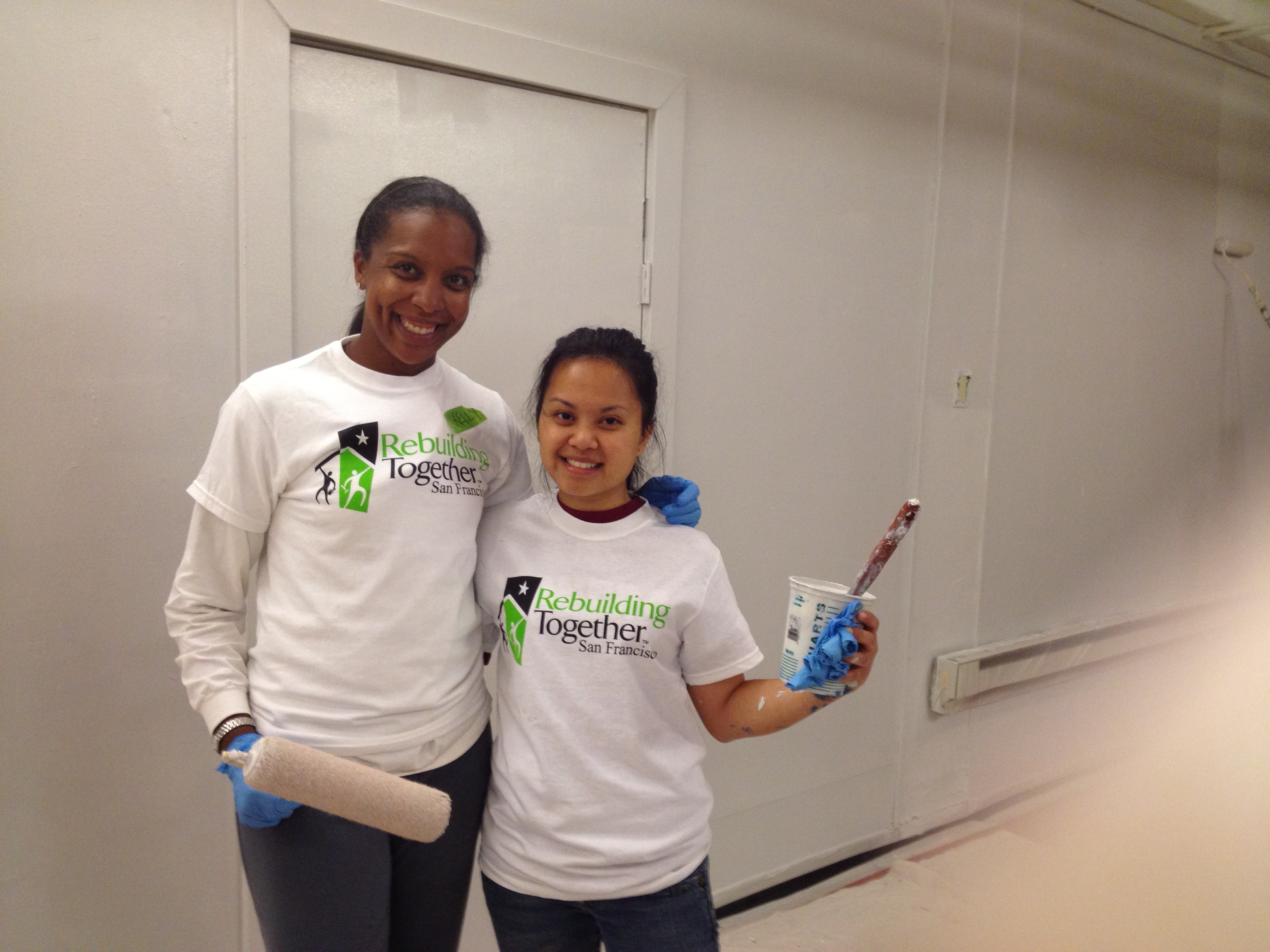
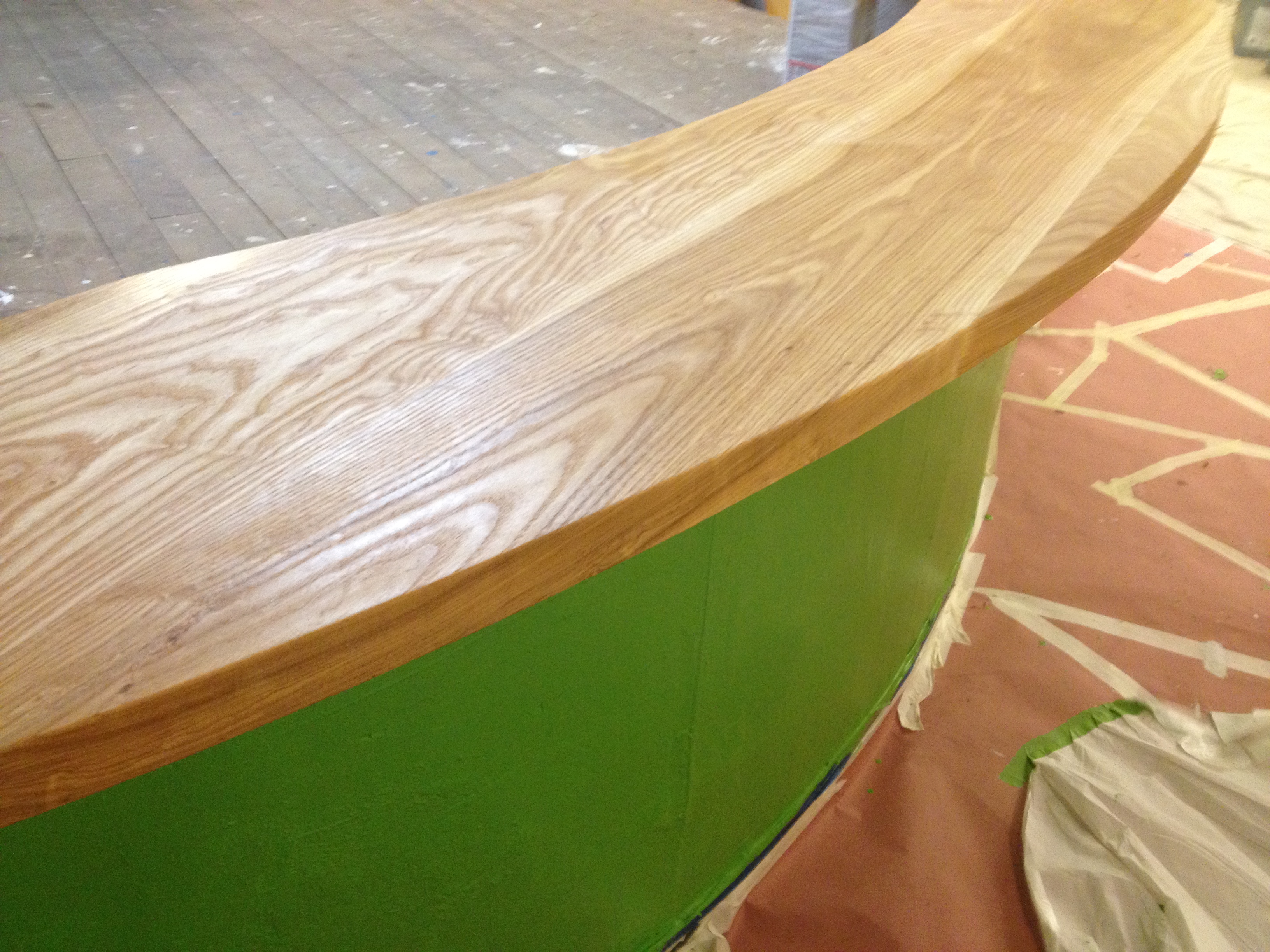
We added new colors, a gorgeous new bar top, freshened up the ceiling and added new pendant lights.  It was truly a group effort and was a great experience.  Here are a few additional shots of all the volunteers helping out.

IMG_0714 IMG_0719 IMG_0730 IMG_0729

The residents were excited about the new space and I hope they’re still enjoying it.  I’m currently looking for a similar organization in Los Angeles that provides opportunities like this. I believe that everyone should have a space that’s comfortable and welcoming.  It was a pleasure being able to help those less fortunate and I would love to do it again.

I’d love to help you design a space that you love and truly represents you.  Please contact me if you are interested.  Follow me on FacebookTwitterPinterest, and Instagram (@joystreetdesign).

Design Files: Loungy Bathroom Update

Last year, I had the pleasure of helping a church update their bathrooms.  I shared the plans and renderings here.  Just for a recap, this was the plan.

C:UsersOwnerDocumentsNew Floorplan.pdf

I don’t have many before pictures as I was called in at the beginning of the construction phase.  But this is how the space looked at that point:

IMG_1964 IMG_1966 IMG_1967

My client was nice enough to send me some phone pictures of the space.  There are still a few things to finish but it’s functional and it looks fantastic.

Bath5 Bath4 Bath3 Bath1 Bath2

My favorite part is the replacement of the bathroom stalls with individual rooms to make it feel less sterile and “public.” I also love the tile around the room and the mosaic tile accents.  Hopefully we’ll get some better pics and finish the design in the near future.

I’d love to help you design a space that you love and truly represents you.  Please contact me if you are interested.  Follow me on FacebookTwitterPinterest, and Instagram (@joystreetdesign).

Design Files: Loungy Bathroom

I had the pleasure of working on a bathroom re-design for a church last month.  It was a relatively small space but the client wanted to work on changing the dimensions while also creating a nice relaxing environment.  The directive I received was to create a bathroom that was similar in feel to a Nordstrom’s bathroom.  These are the inspiration images the client provided:

The initial layout had two small bathrooms.  Before I came on to the project, the pastor and crew came up with this new layout.

I was to focus on the women’s bathroom so I made a few tweaks and came up with this floorplan instead:

Instead of having a door that led to two industrial looking stalls, we decided to remove a wall and create floor-to-ceiling dividers between the toilets.  This created a little more space in the entryway while also giving a more high-end look to the functional part of the space.  I then created a seating area across from the vanity to create a more “lounge feel” similar to the inspiration images.

For finishes, the budget was tight but we were able to find travertine tiles at a great deal.  We will use the travertine on the floors and up the walls with a decorative mosaic as a chair rail of sorts to break up some of the travertine.  Here is a rendering of the space:

The client didn’t love the turquoise color and we haven’t picked a sofa/loveseat yet but the construction work is finished and the tile is being installed.  I’ll post real pictures when it’s all done!

Have a great weekend!!

Design Files: Bedroom Makeover

I recently completed a bedroom project which has to be one of my favorite to date. My client is a very stylish nonprofit executive. His bedroom was definitely not a true reflection of his style or class. He has lived in this apartment for years and had never really gotten around to doing anything to the bedroom. He wanted a stylish, sultry, and adult bedroom space. Here are a few before pictures:

Ignore the mess…he’s going to kill me for posting these before images.

Great bay window but completely ignored now.

And this is how it looks now:

The first thing I wanted to do was get more use out of the bay window. We created a window bench and added curtains in front of the bench to create a nook for laying in the window. The curtains were the first thing in the room that we picked so we used that as the jumping off point for the color scheme. My seamstress included blackout lining on the curtains so that at night he could close off the entire nook and have a very dark room for sleeping.

Window nook with bench and curtains

Bay window nook closed with blackout curtains

The room is a decent size so we painted the room (including the ugly closet doors) a rich deep teal (SW Tempe Star). It reads much more navy in the pics but it’s so yummy on the walls in the room (our contractor actually used it in his bedroom after applying it to this room).

Lastly, I wanted to bring in some brass/gold accents. I’m in love with the light fixture that is brass but has a pop of teal inside the fixture. For such a statement piece, it was super inexpensive!

Hanging pendant

To bring in more brass accents, we included it in the curtain rod and changed out the knobs on the dresser, nightstand, and bench.

In-progress Instagram pic

With the addition of a painting purchased by my client, I think the room really comes together. It feels warm and inviting. I definitely wanted to take a nap that day!

All “after” photos taken by Samantha Cooper Photography.

If you would like help creating a space you love, please contact me for design services.

Design Files: Modern Home Office

I had the pleasure of working on a home office project that allowed me to use different products to deal with a tricky wall of mirrors. This client was really fun but truly had no clue about the type of design she wanted in the room.  The only direction she gave me was that she wanted a modern design and a large desk.  Here are the before pictures:

This room was the gym in the model home and included a “lovely” wall of mirrors.  The mirrors helped make the small room feel much larger but most non-narcissistic people don’t want to stare at their reflection while they sit at the desk.  The homeowner didn’t want to get rid of the mirrors for a variety of reasons (including costs and potential resale value) which required us to come up with an idea for how to hide it.  I researched a variety of ideas including attaching fabric to the wall or adding a full wall of storage or a built-in desk solution.  Eventually I decided that these awesome wall graphic decals from Blik would be an inexpensive way to hide the mirrors and add visual interest to the small room.  (Unfortunately, it looks like they don’t carry the color that we used for this design but they have introduced new colorways.)

So let’s look at some of the after pictures: 

Because the space was so small and the homeowner wanted a very large desk (it is an office after all), we kept the other parts of the room open and bright.  The walls are painted a soft gray (Popular Gray – SW 607) and the window treatments were white.  We also installed a new drum shade light fixture and kept most of the other furnishings white.

A fun part of the room was the bedroom closet.  We took the doors off the closet and painted the inside of the closet a dark grey.  We then created a little nook for the printer and bookshelves.

Besides the wall decal, my favorite part of the room is the vintage orange chair.  This chair was originally owned by the homeowner’s grandfather and she was using it in another room.  We moved it to the office and used that as the pop of color to bring more personality into the fairly neutral room.

One last pretty image…I love that wall tile!

If you would like help creating a space you love, please contact me for design services.